EN
EN  NL
NL 
Packaging. It affects us more than we think. That's why in this blog, you'll get practical tips to create a captivating packaging design!
Did you know that packaging is so influential that it can even affect the perception of the product? During an experiment, participants were allowed to eat two types of crisps. What they didn't know was that the researchers had swapped the packaging and the crisp flavours. The outcome of this research? Astonishing: there were respondents who ate the crisps believing the flavour matched the packaging. A large part realised something was off with the taste but couldn't pinpoint what the flavour actually was.
Practical Tips for Good Packaging
Packaging is evidently much more than a container of goods. It is an integral part of the product experience. Change the packaging, and you change the product. Below you will find practical tips to ensure your packaging is appealing. These come from our previous neuromarketing research on packaging.
Recognisability
Our brain mainly works on autopilot. We therefore reach for the product we were satisfied with last time. Change the packaging and you disrupt this process.
Tropicana learned this the hard way. When the brand introduced new packaging and threw all recognisable brand assets in the bin – particularly the iconic image of the straw sticking out of the orange – their sales plummeted by 20%. After 6 weeks without improvement, the brand concluded that recognisability was more important than a snazzy fresh design. The beloved packaging returned and sales recovered.
Attracting Attention
Besides brand recognisability, it is also important that the packaging grabs the attention of casual passers-by. In other words: does the packaging design succeed in attracting attention with a fleeting glance at the shelf? Psychologists call this bottom-up attention. This form of attention is driven by:
- Size (large objects stand out more than small ones)
- Contrast (the purple cow automatically stands out among its black-and-white peers)
- Shape (slightly unusual packaging shapes are interesting)
- Elements that automatically trigger our attention radar (faces, appealing visuals, pets, the word ‘free’)
It is beneficial when the packaging strongly contrasts with its neighbours. But contrast within the packaging itself also finds its way to your retina more easily. These principles are nothing new to psychologists dealing with visual perception, but they are indispensable drivers of attention and thus sales.
![]()
In this image, we see a product with a 'heatmap' thanks to Eye Tracking. Where people mainly look is coloured red. The logo and the product (the cookies) are well seen.
Value Communication
The third and most complex packaging challenge is value communication. Packaging that automatically gives us the feeling that ‘it’s right’. However, many texts and visuals we encounter in the store leave the consumer completely cold. They probably ended up on the packaging as a result of interviews and focus groups.
“Logo? Unnecessary, keep it small.” “No sugar added? I find that a relevant claim!” “That visual? You've had it for years, it's not up to date anymore, is it?” Each one a red herring fuelled by rationalisation and social desirability. However, when we test packaging with methods that better capture the actual reaction, we see a completely different picture. Through behavioural research, unconscious association tests, eye tracking and brain activity (EEG) we know that small packaging elements can make a big difference. A selection of practical insights in this area:
Insight 1
Show the product. Our brain is charmed by packaging that shows the product. Especially transparent windows that show the actual product can count on a significant boost. An exception to this rule are products that are not necessarily considered tasty, such as vegetables.
Insight 2
Centre of gravity. Where do you place the centre of gravity of the text and visuals you depict on the packaging – low or high? This arbitrary design issue turns out to have a major influence on the expectations it creates for the customer. A low centre of gravity feels mentally heavier; perfect for products you want ‘a lot of’, such as a box of washing powder or a bag of coffee beans. A high centre of gravity feels lighter, which is effective for light and soft products.
Insight 3
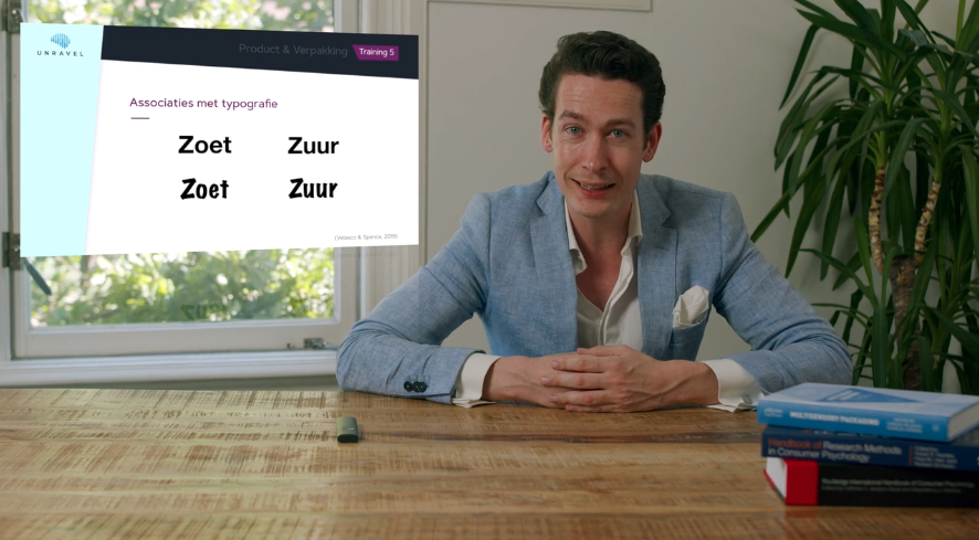
Appeal to the senses. Just like in-store experience, our senses also crave congruent stimulation during packaging interaction. In this area, there are numerous ingrained associations of elements that go well together. For example, we associate round fonts with sweet and angular fonts with sour or bitter. In fact, the fonts literally change our taste experience. A soft packaging with soft-touch varnish increases the softness expectation of the product and is effective for chocolate, toilet paper, and crustless bread.
In the Retail Training, you learn even more about Packaging Design. Curious? Take a look at The Master of Retail and Psychology & Shopper Neuroscience page!